Pleasurable Bargains

This is the new cover for the print edition of PLEASURABLE BARGAINS, which has just come out from Ellora's Cave. It's actually a compilation of my two shorter erotic Regency e-book stories, 'Eden's Pleasure' and 'Antonia's Bargain'. It's available at all the usual places, including the EC eBay store. Luckily for me, EC decided to put this out just in time for the RWA conference in Dallas, which means I get to sign it at the literacy signing "Readers for Life" on July 11th from 5:30-7:30, which is open to the public and features all the big names of romance, including some of the more illustrious crumpets here!(oh,and me)
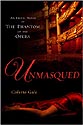
We've talked a lot about man titty on this blog and very little about woman titty-mainly, I suppose, because you just can't show even the hint of a nipple on a romance novel cover. (although Celia's cover on the right comes pretty close!) I must admit that when I first saw this cover from EC, the luscious lady had a few little rolls of fat at her waist. Now, I'm all for natural-looking women on covers and I love her curves but I sheepishly asked the darling art dept at EC if they could remove those tiny love handles-mainly because they reminded me how I might look if posed just so...and romance is all about fantasy, yes? So forgive me if she seems too perfect-the fault is all mine...
I'm currently looking at potential covers for another book I have coming out at the end of the year. It's always interesting to see how a cover evolves. It always takes me a while to get my head around someone elses idea of what my hero or heroine looks like. Apparently books with blond heroes on the cover don't sell as well as books with dark heroes, which is a pity because both the hero and heroine of the book in question happen to be blond. (memo to self: never do that again)
Does it annoy you when the cover of a romance novel doesn't reflect the author's description of the hero/heroine? Or are there any particular covers you think have been done to death? (personally I'm fed up with the woman running from deathly peril in high heels thing (who would keep their shoes on?) and the classic clinch)
![]()


3 comments:
just can't show even the hint of a nipple on a romance novel cover.
This is mind bogglingly hypocritical and silly. I find women's breasts much more interesting than men's. There's so much more variety unlike the gleaming waxed, oiled, flexed, ripped monotony of mantitty.
Nice cover!
Yes, it is a nice cover, and I agree with Jane about silliness and hypocrisy.
What I really want in a cover is something not quite representing the actual characters inside. Something like it, that has its own resonance, and gets the reader to thinking about what the book might be about. For the Carrie books, for example, what I would have liked is a detail from the work of Egon Schiele or Balthus.
My covers have yet to match the characters. I haven't heard any objections. I suppose we ought to be grateful we're not writing fantasy.
Post a Comment