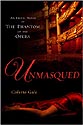
Covers and Consternation: a controversy continued...
... or further thoughts on Jane's mantitty post.
Maybe I find myself so singularly unmoved by those perfect-pecs-and-abs combos adorning romance covers these days because I live in San Francisco -- where not only is the look mass-produced in the gym, but where it's done so well and so often by so many gay men.
While as for clinch covers, I usually find them a bit clammy to the... touch? Well, to the eye, anyway, because among all the clinching there isn't really much touching, is there? I think that what creeps me out is that clinch cover artists are still using techniques from the heyday of the bodice-ripper, when clothes might have fallen away but hands were kept visibly out of trouble: nobody was ever actually doing anything that could even distantly be construed as heavy petting -- because that would be pornographic. And not romantic. Rather than pull up an example from clinch cover hell, though, I offer instead this dreadful photo that was in Vanity Fair a few years ago, of San Francisco's cute mayor Gavin Newsom and his then-wife, Kimberley.
Doesn't it look like a clinch cover? Same awkward head and neck position, same extreme stiffness and rectitude.
What could the photographer -- or his subjects, for that matter -- have been thinking?
But there's something else, something snarkier and more difficult to explain, that bothers me about both the clinch and to the male torso cover.
Hang in with me while I try to think it through. My starting point is that I don't think it's the job of a book cover to "illustrate" what's going on inside the book of fiction. I think rather that a cover should try to present an image that corresponds in some way to what the author is trying to get at, but not by drawing a picture of it. Rather, it should be a graphic shot at the same idea , atmospher -- the same world -- that the author's trying to get at verbally.
But while the torso covers are certainly suggestive rather than illustrative, they're too generic -- hey, it wasn't for nothing that we used to call the gay men who sported those cookie-cutter perfect bodies "Castro clones."
One wants an image that suggests a way of looking at the world, but is neither a Pavlovian signal nor an illustration. Certainly I don't think of the cover of The Slightest Provocation as a picture of my heroine M ary Penley.
I think, rather, that the painting it was taken from (Sir Thomas Lawrence's portrait of the Countess of Blessington) was a highly successful image of a beautiful and glamorous woman as the Regency would see her. Which is not exactly how we see a beautiful and glamorous woman (though the Countess is certainly still plenty easy on our 21st century eyes). She's just enough of her time and not of ours, to shoot a little spark of mystery, excitement, unfamiliarity, and disjunction through the gap between eras and sensibilities.
Which is the same spark -- well, in this case it's a heavy jolt -- that I got from the Ingres nude that Jane Lockwood posted recently. Like Lawrence's Lady Blessington, he's great to look at. But also like her, he's fascinating partly because I don't understand him fully.
Here he is again -- I hope I'm not boring any of you by bringing him back once more. He's an image from a time that's not ours, but that we can dream and stretch our imaginations (or, oh... our whatevers...) upon. As to what masculinity meant, how a man might try to represent it in his posture and expression.
Because -- and here's the difficult, and for me the interesting part. When we write an erotic romance, we begin with physical attraction and then we put it through the wringer of the disparities of power and sensibility that make love so difficult. The sex scenes aren't only entertainment (though they'd better also be that); they're also stages in the progress of this struggle. And when we write an erotic historical, we draw upon different views of power and sensibility than the ones we negotiate in our day-to-day lives.
So when we write an erotic historical romance, I don't think I want the physical sex to be 100% recognizable, familiar, and of the same worldview as Cosmo's last 30 or 50 or 70 Hints on How to Drive Him Wild in Bed?
Because although we're describing the same basic equipment, because I can't believe that it felt entirely the same two hundred years ago, when social beliefs and customs were so different. Hey, it didn't feel the same to me -- before and after I'd read Our Bodies, Ourselves.
Not that it's so easy to portray these subtle changes in intimate psychology. Myself, I'm usually going for a reasonably accurate themepark sort of rendition. But I do try to imagine what it might have been like to feel -- to be -- beautiful, strong, desirable, or powerful in a time when these qualities had different meanings than they have now.
Because -- just possibly and to bring it all back home once more -- I have this other set of suspicions: that I and we might we actually enjoy seeing ourselves and our times, through the shifting, shimmering veil of other eroticisms and aesthetics.
![]()


7 comments:
Pam knows I'm 100% with her on this cover issue. I don't find that "mantitty" draws me to a book (though I must admit that its drawing me to the theatre for a second time this week; 300: The Imax Experience is calling me, LOL!!). In fact, I’m far more likely to buy a book like Pam’s TSP, or Candice Hern’s latest Widows series, than I am to pick up “mantitty” or “clench”. But then I’m “not normal”. LOL! I fall clearly into the “highbrow bitch” demographic of romance readers. I pretty much always prefer the English or Australian covers of historical romances to the American ones.
And I have to say I had a twinge of hurt feelings when I saw a website knock the cover of my debut book, Lord Sin,as “none historical” [sic]. *le sigh* I guess it is, but it’s still awfully pretty mantitty, IMO. *grin* And just how can a naked man be “non-historical” (as I assume the blogger meant)?
Well, the Ingres male nude is historical, Kalen. A naked man -- no matter how pretty, and your cover guy certainly is -- who got his shape from nautilus is not. And it's not that I love "historical" because it's good for you, like eating your spinach... or whatever. But because it's a leap away from us, and therefore more surprising, sizzling.
I think you've hit the nail on the head, beauty-wise. What was considered beautiful in the time period we write about is not considered beautiful today. I'm all for the lush curves and softness of the Regency period-possibly because I'd feel more comfortable there.
It's always amused me that then, looking plump and well fed was a sign of your high social class (you could afford to eat well), and now, looking like a tooth pick is considered the ideal because you can afford to have it all straightened out with a bit of plastic surgery. (apologies to anyone naturally skinny, I don't mean you!)
As most of us know, the cover we end up with for our book isn't necessarily what we expected or particularly like-that's mostly out of our hands until we get super rich and powerful.
I've actually had women on both of the covers of my historicals for Ellora's Cave and they are both beautiful. But my futuristic cover with the male torso outsold them 2 to 1 (just sayin')
But my futuristic cover with the male torso outsold them 2 to 1 (just sayin')
I had lunch with a bunch of authors who were discussing this, and based on their comments about their own books and sales, and what Sue Grimshaw has said, much as I dislike the mantitty it does sell.
And so, after all, do clinch covers, or so Avon insists -- at least they sell to a certain segment of the Avon readership. Though I've never understood why certain authors sell more with a clinch cover while others don't need one...
...any more than I understand the rest of these market phenomena.
I would like to understand it. But what I'd really like is for things to change.
Which they will. They always do in this business. Of course no one can predict how. But I'm for stating strong preferences rather than accepting the status quo.
Great post.
I love covers based on portraits. Have you noticed how frequently the portrait is cropped below the eyes, which gives a further sense of mystery?
Have you noticed how frequently the portrait is cropped below the eyes...
...to obviate any glimpse into the narrative "windows of the soul" and focus instead on the design of the whole graphic -- as it plays against the design of the text. Back in the early days of feminism, we were wildly against any form of "objectification," but we were wrong; these things are more complicated than that.
Post a Comment